Courtesy of underconsideration.com
Welcome to the Oilerland blog! A different type of sports blog, here I will forgo the stats and on-ice talk and instead will focus on off-ice fashion, marketing, branding, arena design, jerseys, and in-game experiences.
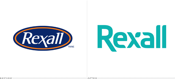
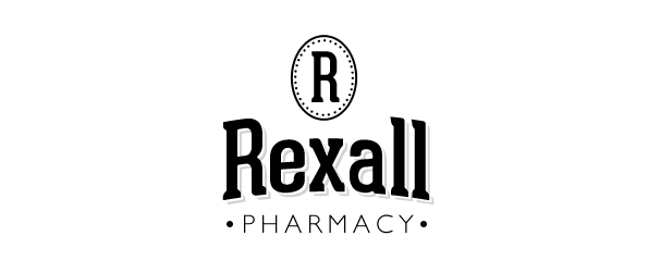
First up is Oilers owner Daryl Katz' flagship brand: Rexall. Recently Rexall Pharmacy rebranded itself from an Oiler-coloured oval with white italic letters to a far more modern sans serif and curvy logo. The new logo is a nice departure from the old logo in terms of shape and design, but does the new colour remind anyone else of death? Also, their new website is a bit of a train wreck.
I get the idea here, and I feel like the logo is very close to being perfect. The elongated "R" harkens back to the elongated "x" in the old logo. A good idea to subconsciously connect to the old logo.
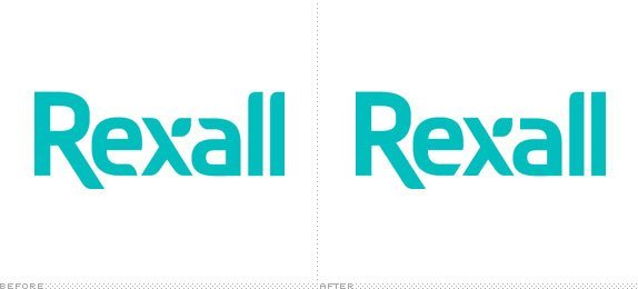
On the underconsideration.com blog, Brand New, one astute comment notes that the finial of the "e" (as well as the "a") in the new logo might look better if it interacted with the "x" as seen below:
First up is Oilers owner Daryl Katz' flagship brand: Rexall. Recently Rexall Pharmacy rebranded itself from an Oiler-coloured oval with white italic letters to a far more modern sans serif and curvy logo. The new logo is a nice departure from the old logo in terms of shape and design, but does the new colour remind anyone else of death? Also, their new website is a bit of a train wreck.
I get the idea here, and I feel like the logo is very close to being perfect. The elongated "R" harkens back to the elongated "x" in the old logo. A good idea to subconsciously connect to the old logo.
On the underconsideration.com blog, Brand New, one astute comment notes that the finial of the "e" (as well as the "a") in the new logo might look better if it interacted with the "x" as seen below:
Courtesy of underconsideration.com
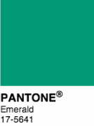
While this slight adjustment looks nice, I am more offended by the colour choice. The colour may look nice in person, or on printed material, but on TV and on the web it's plain ugly. Recently, Pantone.com listed Emerald as the pantone of the year. While not the nicest colour in the world either, it's at least trendy.
While thinking about the new Rexall logo I wondered what I would do with the Rexall brand. Simply all I would do is change the colour:
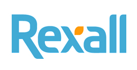
I left the shape of the logo alone and merely changed the colouring. The two-toned look allows for the "leaf" on the "x" to become a more pronounced part of the design language. It enhances this unique flourish and allows for it's use in packaging and secondary design. While my colour choice may not be perfect either, I feel it does two things: first, it reminds me of water, not death. Second: it roots the logo in it's original basic colours of orange and blue while distancing it from the Oilers (I assume this was part of the intent in going to green). The Rexall competitors currently "own" dark blue (London Drugs), and red (Shoppers), and although green is not "owned" by a major competitor (that I know of), it does bring to mind plant health as opposed to personal health. Subtle, but that's my excuse. I went with a lighter blue as a reminder of fresh water, the essence of human health.
I also had some fun with some hipster branding of Rexall. Because why not.
 RSS Feed
