Here's an October 2013 schedule wallpaper for ya! 1280 x 800 for now. Been a bit busy these days so just the one size for this one. Enjoy and GOILERS!!
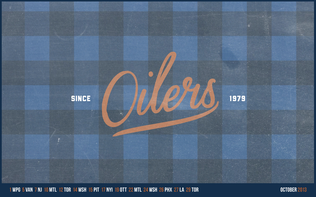
right click, open in new tab for full rezzie.
|
Here's an October 2013 schedule wallpaper for ya! 1280 x 800 for now. Been a bit busy these days so just the one size for this one. Enjoy and GOILERS!! right click, open in new tab for full rezzie.
1 Comment
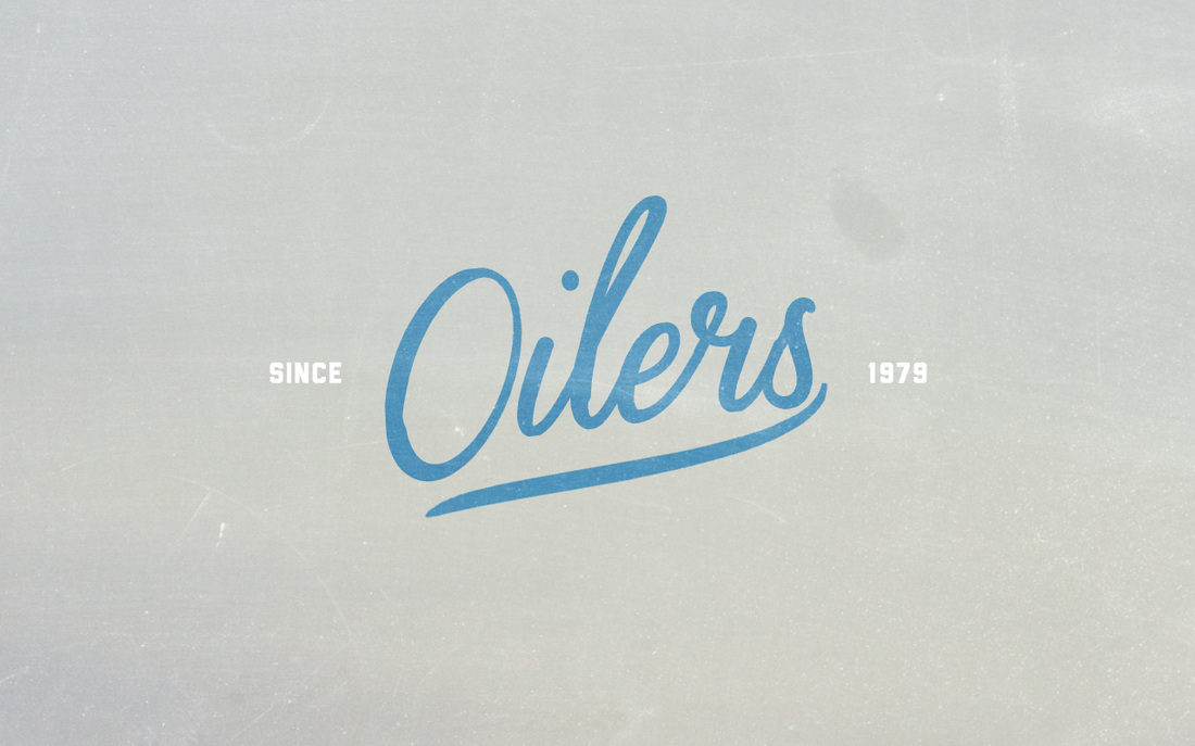
Here's a new wallpaper series for the start of the 13-14 season! The Oxford collection focuses on the beautiful lines and curves of the oilers logo. See the entire series in the menu above! And as always, #GOILERS 
Click HERE for the wallpaper in all it's high-res 1680x1050 glory 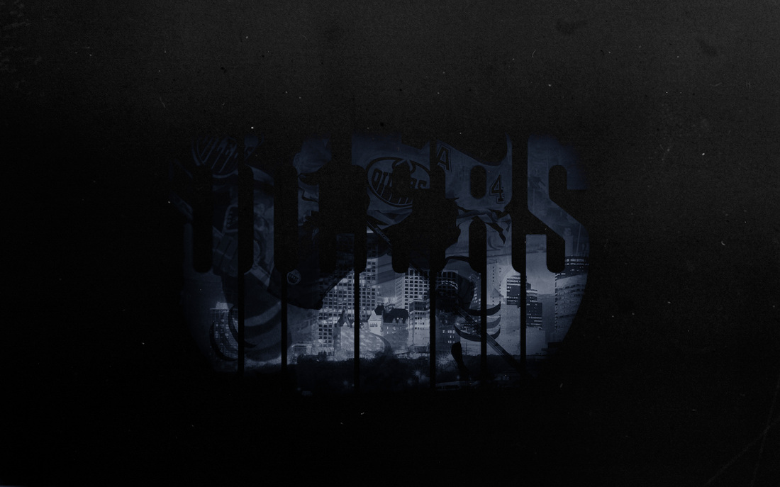
My fantasy cover for EA NHL14, be sure to vote for Hall to be on the cover, and to enter the Oilers NHL14 cover contest on edmontonoilers.com ! 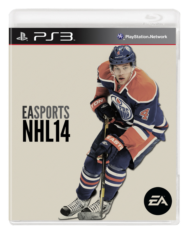
I am awful at predictions. I predicted Carolina to finish 2nd this year...aaaaand they're not in the playoffs. Anyways here are my picks, my pre-season cup winner pick was the Rangers, so I'll stick with them...reluctantly. I'd love to see a Chicago/Pittsburgh final, however. Please comment below and tell us your picks! Update: The NHL has an awesome bracket challenge this year. I have set up a league called "Oiler fans on twitter" if you want to join in! 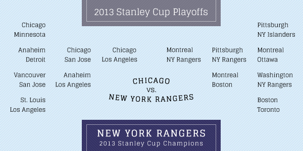 To close out the season, I present "Leeds", the new wallpaper collection from Oilerland. The collection includes Desktop (1280x800), ipad, and iphone. To access the collection click Leeds in the menu above, or click here. It was an interesting season to say the least, but win or lose, we are Oilers for life. Here's to next year. Orange & Blue forever. 
In response to the Minnesota Wild's Brodin infographic, I have put together a response to elect Nail Yakupov for this year's Calder Trophy. UPDATE: The NHL Season has concluded so the infographic has been updated for a final time@ For a hi-res version click here. 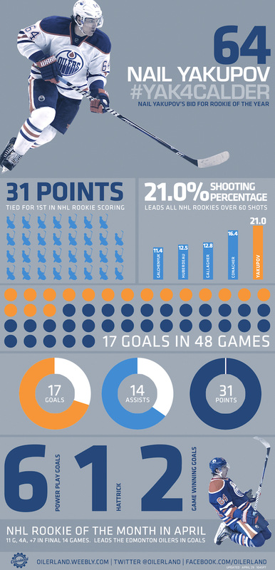 At times, the NHL is infuriating, and at times the NHL is absolutely brilliant. During the frustrating lockout, word spread about the NHL conducting focus groups to figure out how to win fans back to the most exciting game in the world. Fans were furious to hear that the NHL figured it could simply win us over with a heart warming message, or some magical phrase designed to turn us into dumb, drooling sheep again. Fans were mad at themselves during the lockout, too. Mad that we even followed the NHL at all, that we ever spent money on a league that would take advantage of us every time a CBA expired, and assumed we'd come crawling back for more. Well, we did. We filled NHL arenas and TV ratings were reported to be high. And what about that heart warming message or magical phrase? Something about a "shared sacrifice"? It never came. There was no ceremony, no suits, no podium. Instead, the lockout ended in the middle of the night with Bettman and Fehr announcing the deal in their casual street clothes. There was an apology from Bettman later on, but the message was simply what the fans wanted to hear: Drop the puck. Get on with it. Game on. 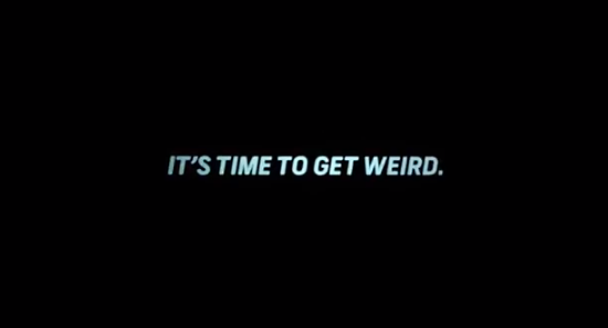
Mad MenRecently, in time for playoff hype, the NHL unleashed it's first-of-five playoff commercials.... and IT. IS. BRILLIANT. Don Draper brilliant. This is what the commercial ISN'T: It isn't heartwarming. It isn't a plea, it isn't an apology, it isn't trickery. It isn't even a sell on hockey or the players. It is a challenge. The NHL is challenging the fans. Brilliant. The NHL is challenging our creativity and inviting us to get weird. They are giving the fans free reign to dress up, build costumes, start new memes, dance, yell, hoot and holler. It's a brilliant way of acknowledging our pent up energy/rage/anger and giving us the freedom to not only express it, but to help amp up the energy again. The NHL needs fans to be excited. That is their hidden message here. TraditionsI hope the NHL is trying to build a fan culture. Each stadium has it's own traditions and unique cheers, but the NHL as a whole doesn't really have a fan culture outside of "GO ____ GO!" and the mexican wave. They aren't trying to shove anything down our throats, they aren't trying to force us to act a certain way, or sing a certain song, or feel a certain emotion. They aren't trying to force new traditions. They are going to let the fans dictate this new culture. And I hope they are simply looking for more great footage.
I hope that this ad campaign is a true effort to build upon what fans already do: the green men, weird costumes, giant heads, random horse masks, you name it. Be weird. Be more weird than last year. What you are doing now is not weird enough. It's a challenge. It's brilliant. I love it. I am the white sheep. 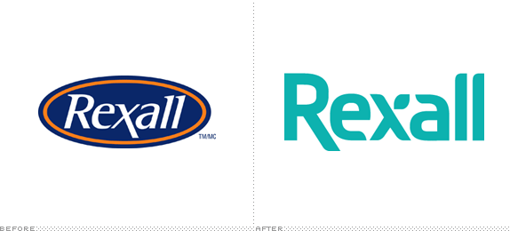
Courtesy of underconsideration.com
Welcome to the Oilerland blog! A different type of sports blog, here I will forgo the stats and on-ice talk and instead will focus on off-ice fashion, marketing, branding, arena design, jerseys, and in-game experiences. First up is Oilers owner Daryl Katz' flagship brand: Rexall. Recently Rexall Pharmacy rebranded itself from an Oiler-coloured oval with white italic letters to a far more modern sans serif and curvy logo. The new logo is a nice departure from the old logo in terms of shape and design, but does the new colour remind anyone else of death? Also, their new website is a bit of a train wreck. I get the idea here, and I feel like the logo is very close to being perfect. The elongated "R" harkens back to the elongated "x" in the old logo. A good idea to subconsciously connect to the old logo. On the underconsideration.com blog, Brand New, one astute comment notes that the finial of the "e" (as well as the "a") in the new logo might look better if it interacted with the "x" as seen below: 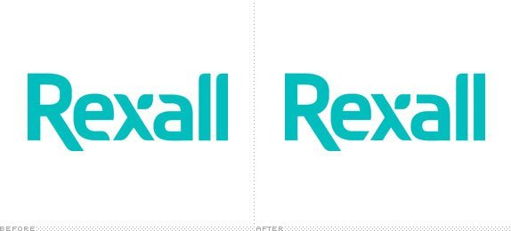
Courtesy of underconsideration.com
While this slight adjustment looks nice, I am more offended by the colour choice. The colour may look nice in person, or on printed material, but on TV and on the web it's plain ugly. Recently, Pantone.com listed Emerald as the pantone of the year. While not the nicest colour in the world either, it's at least trendy. 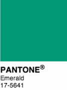
While thinking about the new Rexall logo I wondered what I would do with the Rexall brand. Simply all I would do is change the colour: 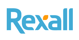
I left the shape of the logo alone and merely changed the colouring. The two-toned look allows for the "leaf" on the "x" to become a more pronounced part of the design language. It enhances this unique flourish and allows for it's use in packaging and secondary design. While my colour choice may not be perfect either, I feel it does two things: first, it reminds me of water, not death. Second: it roots the logo in it's original basic colours of orange and blue while distancing it from the Oilers (I assume this was part of the intent in going to green). The Rexall competitors currently "own" dark blue (London Drugs), and red (Shoppers), and although green is not "owned" by a major competitor (that I know of), it does bring to mind plant health as opposed to personal health. Subtle, but that's my excuse. I went with a lighter blue as a reminder of fresh water, the essence of human health. 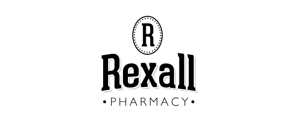
I also had some fun with some hipster branding of Rexall. Because why not.
|
OilerlandWelcome to Oilerland, a design site dedicated to the Edmonton Oilers. We have T-shirts and hoodies, and check out the free wallpaper collections in the menu above! Archives
September 2013
Categories
All
|
 RSS Feed
